Dark themes are everywhere today — apps, dashboards, tools. They look modern, focused, and comfortable… but only when done right.
A poorly designed dark UI can be just as painful as a bad light UI:
❌ too much contrast = neon-sign feeling
❌ too little contrast = muddy, unreadable mess
❌ zero depth = everything blends into one flat box
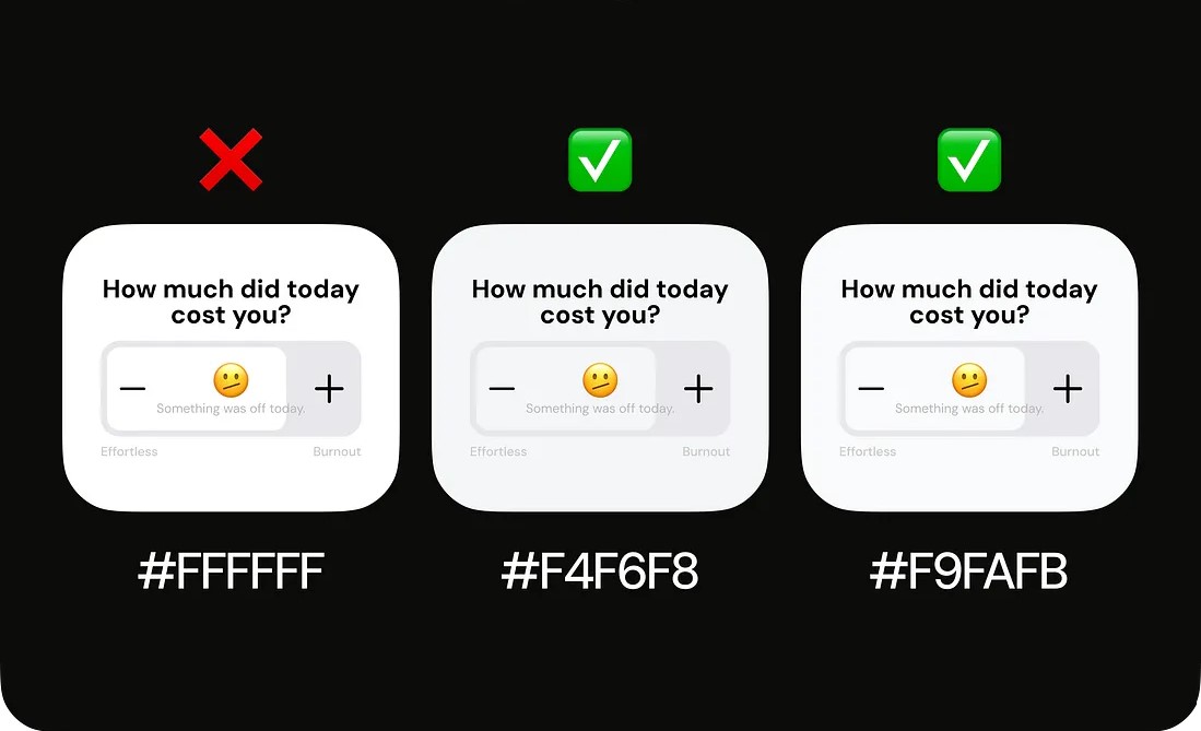
After years of designing dark interfaces for SaaS, dashboards, and mobile apps, here’s the truth: Dark mode requires its own design system. Not just darker colors.
In the full blog, I break down:
✔️ how to choose the right neutrals
✔️ how to avoid the “eye-strain trap”
✔️ how to build depth without brightness
✔️ typography rules for dark UI
✔️ the biggest mistakes designers make
✔️ tools & plugins for perfect dark themes
If you design in dark mode (or want to), this is a must-read.
👉 Read the full article here: https://skynix.co/resources/designing-dark-ui-that-actually-works

