Ever used an interface that felt instantly right?
No guessing. No friction. No rage-clicking.
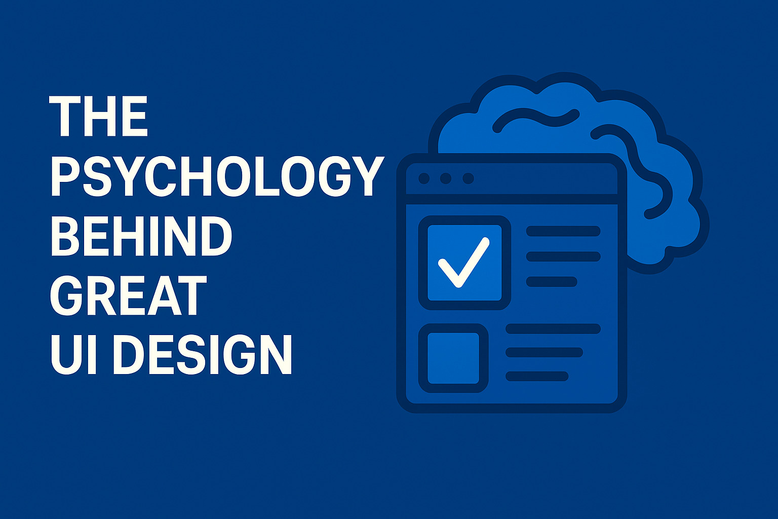
That’s not luck — that’s psychology in design.
Great UI doesn’t happen because the layout “looks nice.” It works because it aligns with how people think, decide, and react. Here are a few principles that make interfaces intuitive and delightful:
🔹 Cognitive Load — Reduce mental effort. One main action per screen. Hide complexity until needed.
🔹 Hick’s Law — Too many choices slow users down. Break big tasks into simple steps.
🔹 Fitts’ Law — Make buttons easy to hit, especially on mobile.
🔹 Visual Hierarchy — Users scan, not read. Guide their eyes through size, color, and spacing.
🔹 Familiarity — Reinventing common patterns often backfires. Stick to what users already understand.
🔹 Gestalt Principles — Group related elements to create clarity.
🔹 Emotion > Logic — People remember how your interface feels.
🔹 Peak-End Rule — Make peak moments and endings memorable.
🔹 Kill Uncertainty — Clear labels. Clear feedback. Clear next steps.
These principles aren’t optional — they’re what separate “looks good” from “feels effortless.”
👉 Want the full breakdown with detailed examples? Read the complete article here: https://skynix.co/resources/why-some-interfaces-just-feel-right

