Why Some Interfaces Just Feel Right?

Ever used an interface that felt instantly right?No guessing. No friction. No rage-clicking. That’s not luck — that’s psychology in design. Great UI doesn’t happen because the layout “looks nice.” It works because it aligns with how people think, decide, and react. Here are a few principles that make interfaces intuitive and delightful: 🔹 Cognitive […]
Designing Dark UI That Actually Works
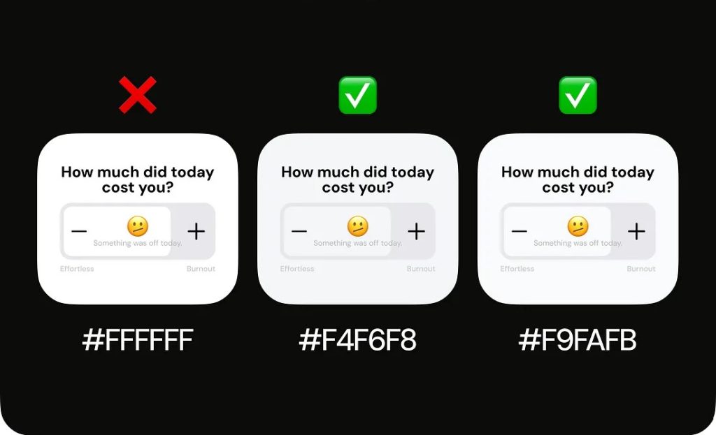
Dark themes are everywhere today — apps, dashboards, tools. They look modern, focused, and comfortable… but only when done right. A poorly designed dark UI can be just as painful as a bad light UI:❌ too much contrast = neon-sign feeling❌ too little contrast = muddy, unreadable mess❌ zero depth = everything blends into one […]
Form Design That Works: 5 Scenarios for Checkboxes and Toggles

When it comes to creating intuitive and user-friendly forms, small decisions—like choosing between a checkbox and a toggle switch—can have a big impact. While they may look similar and both represent binary choices (on/off, yes/no, enabled/disabled), they are not interchangeable. Understanding when to use each helps enhance usability, reduce errors, and create a more polished […]
Effortlessly Remove Image Backgrounds

Solve mismatched background issues effortlessly and enhance your web design!
Must-Have Figma Plugins for 2024

In today’s fast-paced design environment, plugins have become essential tools for enhancing creativity and efficiency.
Designing Dark Mode UI
Learn the importance of proper color naming in UI/UX design for seamless light and dark mode transitions.
B2C vs. B2B Design: Understanding the Key Differences
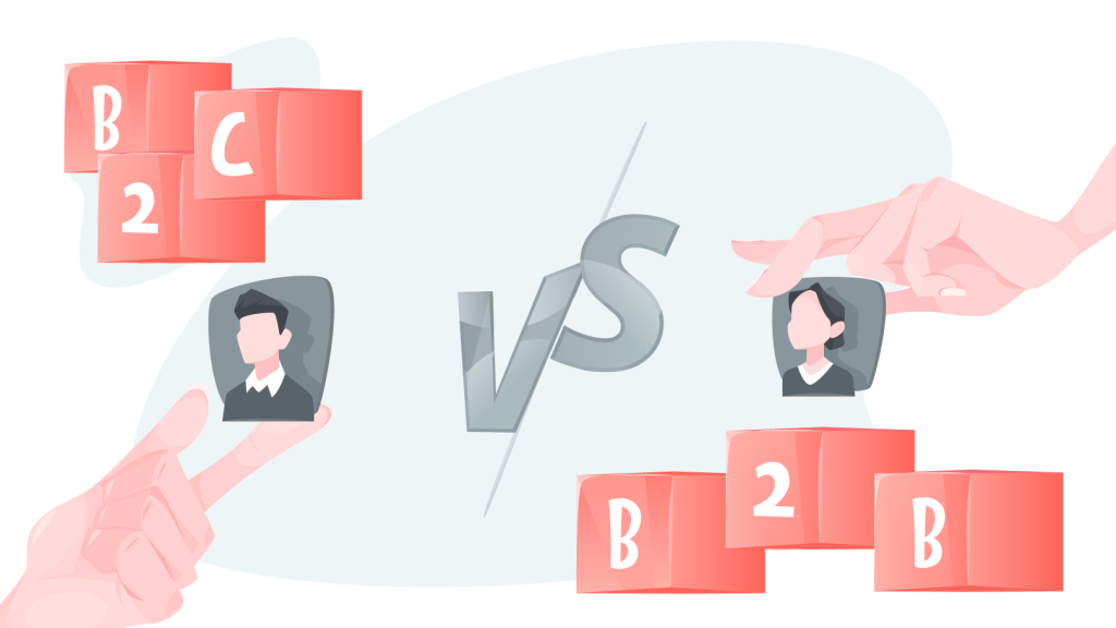
B2C (Business-to-Consumer) and B2B (Business-to-Business) designs serve distinct purposes and cater to different user behaviors.
Essential Figma resources every designer should know about

Dive in and discover how to make the most of Figma in your design projects.
Mastering UI: Essential Principles for Success in 2024

In today’s fast-paced digital landscape, creating user interfaces that captivate and retain users’ attention is paramount. UI design principles serve as the cornerstone for crafting interfaces that seamlessly guide users towards their goals.